
#FBF7F2
#E3D3C4
#A88B73
#5C4536
| Swatch | Name | HEX | RGB | HSL | OKLCH |
|---|---|---|---|---|---|
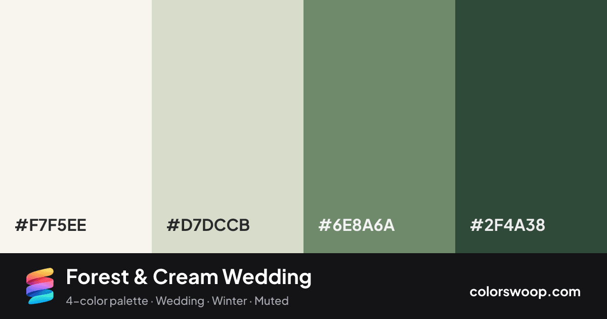
| Smoke | #F7F5EE | rgb(247, 245, 238) | hsl(47, 36%, 95%) | oklch(97.0% 0.010 94) | |
| Bone | #D7DCCB | rgb(215, 220, 203) | hsl(78, 20%, 83%) | oklch(88.6% 0.023 120) | |
| Shadow | #6E8A6A | rgb(110, 138, 106) | hsl(113, 13%, 48%) | oklch(60.3% 0.057 142) | |
| Evergreen | #2F4A38 | rgb(47, 74, 56) | hsl(140, 22%, 24%) | oklch(38.2% 0.045 155) |
Forest & Cream Wedding is an analogous color palette tagged wedding, winter, muted. Analogous neighbors on the wheel (Bone, Evergreen) give it a natural, low-tension flow. Saturation is moderate, which keeps it flexible for both interfaces and print.
It works because the lightness range is wide (24% to 95%), which gives clear hierarchy between background, content and accents. Try it for invitations and event branding.
2 of 6 color pairs pass WCAG AA (4.5:1); the strongest is Smoke on Evergreen at 8.92:1.
A palette preview that turns four colors into a page, so you can judge hierarchy, contrast and mood before you commit.
Primary action SecondaryColor-blind check: all four colors stay distinguishable under protanopia, deuteranopia and tritanopia.
| Pair | Sample | Ratio | Level |
|---|---|---|---|
#F7F5EE on #2F4A38 | Aa | 8.92:1 | AAA |
#D7DCCB on #2F4A38 | Aa | 6.95:1 | AA |
#F7F5EE on #6E8A6A | Aa | 3.5:1 | AA large only |
#D7DCCB on #6E8A6A | Aa | 2.72:1 | Fail |
#6E8A6A on #2F4A38 | Aa | 2.55:1 | Fail |
#F7F5EE on #D7DCCB | Aa | 1.28:1 | Fail |