
#B08968
#DDB892
#E6CCB2
#FFF6EA
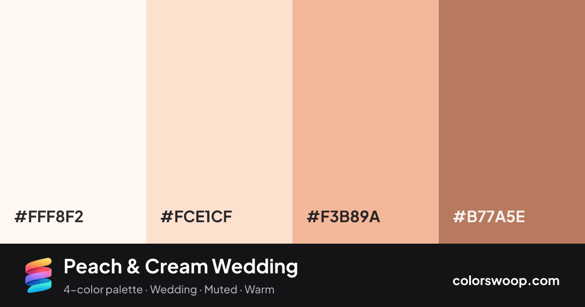
Peach & Cream Wedding is a vivid light, monochromatic color palette tagged wedding, muted, warm. A monochromatic set: the same hue family from Clay down to Snow. Saturation runs high, so use the brightest color sparingly and let the others carry the surface area. The overall temperature is warm.
The palette holds together thanks to its monochromatic hue relationship and a soft light-to-dark ladder (97% down to 54% lightness). A natural fit for invitations and event branding.
No pair inside the palette reaches 4.5:1, so add black or white for body text.
A palette preview that turns four colors into a page, so you can judge hierarchy, contrast and mood before you commit.
Primary action SecondaryColor-blind check: all four colors stay distinguishable under protanopia, deuteranopia and tritanopia.
| Pair | Sample | Ratio | Level |
|---|---|---|---|
#FFF8F2 on #B77A5E | Aa | 3.35:1 | AA large only |
#FCE1CF on #B77A5E | Aa | 2.82:1 | Fail |
#F3B89A on #B77A5E | Aa | 2.04:1 | Fail |
#FFF8F2 on #F3B89A | Aa | 1.65:1 | Fail |
#FCE1CF on #F3B89A | Aa | 1.39:1 | Fail |
#FFF8F2 on #FCE1CF | Aa | 1.19:1 | Fail |