
#F8F3EC
#C9D2BE
#8C9E82
#C4785A
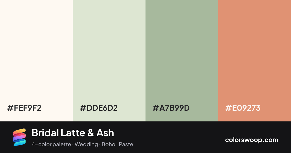
Bridal Latte & Ash is a pastel light, split color palette tagged wedding, boho, pastel. The hues span about 70°, enough contrast to create a focal point without the harshness of true complements. The colors are light and airy, which suits friendly, soft-spoken brands. The overall temperature is warm.
Two of the four colors are near-neutral, which leaves room for Pearl to lead. Lightness runs from 66% to 97%. Well suited to invitations and event branding.
No pair inside the palette reaches 4.5:1, so add black or white for body text.
A palette preview that turns four colors into a page, so you can judge hierarchy, contrast and mood before you commit.
Primary action SecondaryColor-blind check: under deuteranopia, Ash and Latte become hard to tell apart, so do not rely on that pair alone to carry meaning.
| Pair | Sample | Ratio | Level |
|---|---|---|---|
#FEF9F2 on #E09273 | Aa | 2.35:1 | Fail |
#FEF9F2 on #A7B99D | Aa | 1.99:1 | Fail |
#DDE6D2 on #E09273 | Aa | 1.91:1 | Fail |
#DDE6D2 on #A7B99D | Aa | 1.62:1 | Fail |
#FEF9F2 on #DDE6D2 | Aa | 1.23:1 | Fail |
#A7B99D on #E09273 | Aa | 1.18:1 | Fail |