
#1C2541
#465D79
#5BC0BE
#FFFFFF
| Swatch | Name | HEX | RGB | HSL | OKLCH |
|---|---|---|---|---|---|
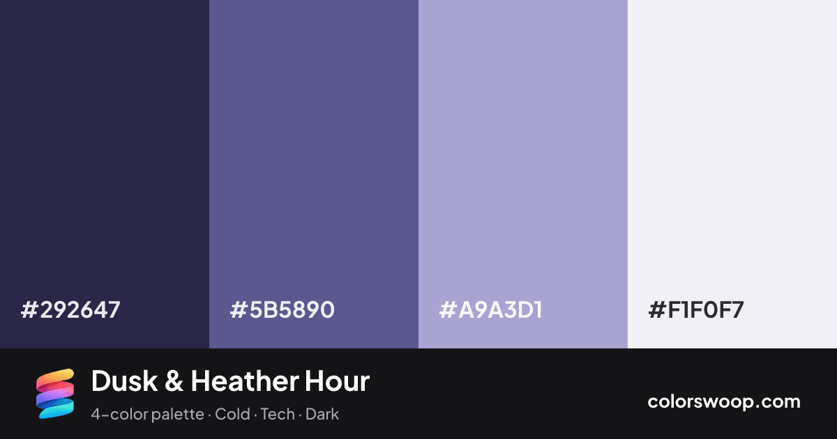
| Space | #292647 | rgb(41, 38, 71) | hsl(245, 30%, 21%) | oklch(28.9% 0.059 286) | |
| Dusk | #5B5890 | rgb(91, 88, 144) | hsl(243, 24%, 45%) | oklch(48.8% 0.089 285) | |
| Heather | #A9A3D1 | rgb(169, 163, 209) | hsl(248, 33%, 73%) | oklch(73.6% 0.066 291) | |
| Frost | #F1F0F7 | rgb(241, 240, 247) | hsl(249, 30%, 95%) | oklch(95.8% 0.009 293) |
Dusk & Heather Hour is a monochromatic color palette tagged cold, tech, dark. All four colors sit within 5° of hue, so the scheme reads as one color explored across light and dark. Neither washed out nor loud, it adapts to most contexts. The overall temperature is cool.
With 3 chromatic colors, Heather takes the lead while the rest support. Lightness runs from 21% to 95%. Well suited to a SaaS landing page or dashboard.
3 of 6 color pairs pass WCAG AA (4.5:1); the strongest is Space on Frost at 12.68:1.
A palette preview that turns four colors into a page, so you can judge hierarchy, contrast and mood before you commit.
Primary action SecondaryColor-blind check: all four colors stay distinguishable under protanopia, deuteranopia and tritanopia.
| Pair | Sample | Ratio | Level |
|---|---|---|---|
#292647 on #F1F0F7 | Aa | 12.68:1 | AAA |
#292647 on #A9A3D1 | Aa | 6.05:1 | AA |
#5B5890 on #F1F0F7 | Aa | 5.72:1 | AA |
#5B5890 on #A9A3D1 | Aa | 2.73:1 | Fail |
#292647 on #5B5890 | Aa | 2.22:1 | Fail |
#A9A3D1 on #F1F0F7 | Aa | 2.1:1 | Fail |