
#1B4332
#2D6A4F
#B7B7A4
#F0EFEB
| Swatch | Name | HEX | RGB | HSL | OKLCH |
|---|---|---|---|---|---|
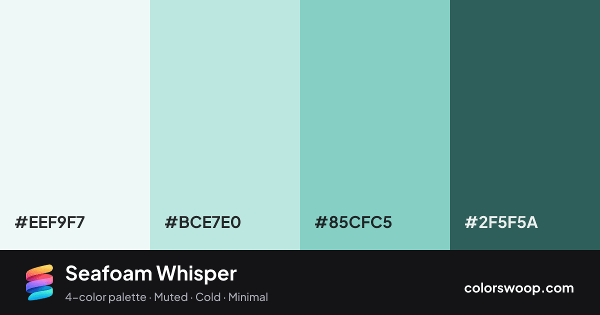
| Smoke | #EEF9F7 | rgb(238, 249, 247) | hsl(169, 48%, 95%) | oklch(97.3% 0.012 184) | |
| Glacier | #BCE7E0 | rgb(188, 231, 224) | hsl(170, 47%, 82%) | oklch(89.6% 0.046 184) | |
| Sky Blue | #85CFC5 | rgb(133, 207, 197) | hsl(172, 44%, 67%) | oklch(80.3% 0.075 185) | |
| Spruce | #2F5F5A | rgb(47, 95, 90) | hsl(174, 34%, 28%) | oklch(45.0% 0.053 187) |
Seafoam Whisper is a monochromatic color palette tagged muted, cold, minimal. A monochromatic set: the same hue family from Spruce down to Smoke. Saturation is moderate, which keeps it flexible for both interfaces and print. The overall temperature is cool.
With 3 chromatic colors, Glacier takes the lead while the rest support. Lightness runs from 28% to 95%. Well suited to websites, presentations and branding.
2 of 6 color pairs pass WCAG AA (4.5:1); the strongest is Smoke on Spruce at 6.72:1.
A palette preview that turns four colors into a page, so you can judge hierarchy, contrast and mood before you commit.
Primary action SecondaryColor-blind check: under protanopia and deuteranopia, Smoke and Glacier become hard to tell apart, so do not rely on that pair alone to carry meaning.
| Pair | Sample | Ratio | Level |
|---|---|---|---|
#EEF9F7 on #2F5F5A | Aa | 6.72:1 | AA |
#BCE7E0 on #2F5F5A | Aa | 5.38:1 | AA |
#85CFC5 on #2F5F5A | Aa | 4.04:1 | AA large only |
#EEF9F7 on #85CFC5 | Aa | 1.67:1 | Fail |
#BCE7E0 on #85CFC5 | Aa | 1.33:1 | Fail |
#EEF9F7 on #BCE7E0 | Aa | 1.25:1 | Fail |