
#1C2541
#465D79
#5BC0BE
#FFFFFF
| Swatch | Name | HEX | RGB | HSL | OKLCH |
|---|---|---|---|---|---|
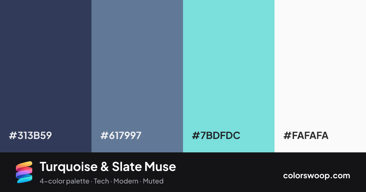
| Charcoal | #313B59 | rgb(49, 59, 89) | hsl(225, 29%, 27%) | oklch(35.7% 0.054 269) | |
| Slate | #617997 | rgb(97, 121, 151) | hsl(213, 22%, 49%) | oklch(56.9% 0.054 254) | |
| Turquoise | #7BDFDC | rgb(123, 223, 220) | hsl(178, 61%, 68%) | oklch(84.2% 0.094 193) | |
| Snow | #FAFAFA | rgb(250, 250, 250) | hsl(0, 0%, 98%) | oklch(98.5% 0.000 0) |
Turquoise & Slate Muse is an analogous color palette tagged tech, modern, muted. The hues stay within 47° of each other on the color wheel, which is why the palette feels cohesive rather than busy. Neither washed out nor loud, it adapts to most contexts. The overall temperature is cool.
It works because the lightness range is wide (27% to 98%), which gives clear hierarchy between background, content and accents. Try it for a SaaS landing page or dashboard.
2 of 6 color pairs pass WCAG AA (4.5:1); the strongest is Charcoal on Snow at 10.59:1.
A palette preview that turns four colors into a page, so you can judge hierarchy, contrast and mood before you commit.
Primary action SecondaryColor-blind check: all four colors stay distinguishable under protanopia, deuteranopia and tritanopia.
| Pair | Sample | Ratio | Level |
|---|---|---|---|
#313B59 on #FAFAFA | Aa | 10.59:1 | AAA |
#313B59 on #7BDFDC | Aa | 7.07:1 | AAA |
#617997 on #FAFAFA | Aa | 4.29:1 | AA large only |
#617997 on #7BDFDC | Aa | 2.86:1 | Fail |
#313B59 on #617997 | Aa | 2.47:1 | Fail |
#7BDFDC on #FAFAFA | Aa | 1.5:1 | Fail |