
#006D77
#83C5BE
#EDF6F9
#E29578
| Swatch | Name | HEX | RGB | HSL | OKLCH |
|---|---|---|---|---|---|
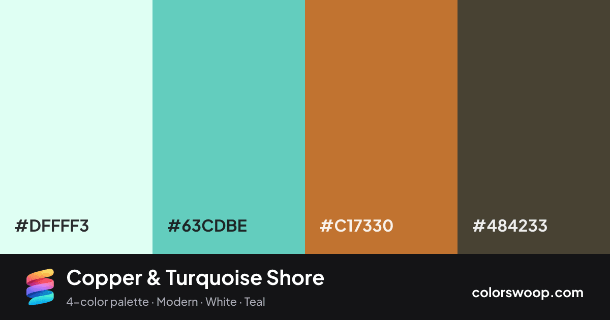
| Smoke | #DFFFF3 | rgb(223, 255, 243) | hsl(157, 100%, 94%) | oklch(97.4% 0.037 171) | |
| Turquoise | #63CDBE | rgb(99, 205, 190) | hsl(172, 51%, 60%) | oklch(78.1% 0.101 183) | |
| Copper | #C17330 | rgb(193, 115, 48) | hsl(28, 60%, 47%) | oklch(62.9% 0.127 58) | |
| Taupe | #484233 | rgb(72, 66, 51) | hsl(43, 17%, 24%) | oklch(38.1% 0.026 89) |
Copper & Turquoise Shore is a complementary color palette tagged modern, white, teal. Near-complementary hues (about 144° apart) make this a high-contrast, attention-grabbing combination. Saturation is moderate, which keeps it flexible for both interfaces and print. Warm and cool hues are mixed, which adds depth.
It works because the lightness range is wide (24% to 94%), which gives clear hierarchy between background, content and accents. Try it for websites, presentations and branding.
2 of 6 color pairs pass WCAG AA (4.5:1); the strongest is Smoke on Taupe at 9.39:1.
A palette preview that turns four colors into a page, so you can judge hierarchy, contrast and mood before you commit.
Primary action SecondaryColor-blind check: all four colors stay distinguishable under protanopia, deuteranopia and tritanopia.
| Pair | Sample | Ratio | Level |
|---|---|---|---|
#DFFFF3 on #484233 | Aa | 9.39:1 | AAA |
#63CDBE on #484233 | Aa | 5.23:1 | AA |
#DFFFF3 on #C17330 | Aa | 3.42:1 | AA large only |
#C17330 on #484233 | Aa | 2.74:1 | Fail |
#63CDBE on #C17330 | Aa | 1.91:1 | Fail |
#DFFFF3 on #63CDBE | Aa | 1.79:1 | Fail |