
#B08968
#DDB892
#E6CCB2
#FFF6EA
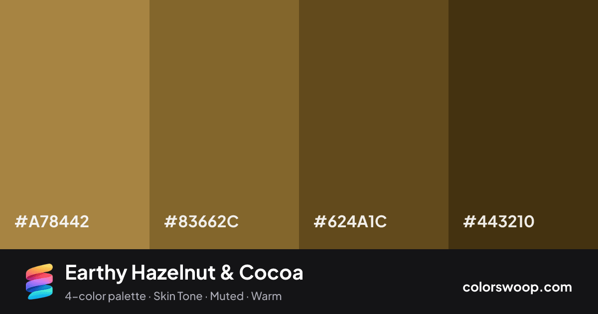
Earthy Hazelnut & Cocoa is a dark, monochromatic color palette tagged skin tone, muted, warm. A monochromatic set: the same hue family from Taupe down to Hazelnut. Saturation is moderate, which keeps it flexible for both interfaces and print. The overall temperature is warm.
The palette holds together thanks to its monochromatic hue relationship and a soft light-to-dark ladder (46% down to 16% lightness). A natural fit for wellness, organic and outdoor brands.
No pair inside the palette reaches 4.5:1, so add black or white for body text.
A palette preview that turns four colors into a page, so you can judge hierarchy, contrast and mood before you commit.
Primary action SecondaryColor-blind check: all four colors stay distinguishable under protanopia, deuteranopia and tritanopia.
| Pair | Sample | Ratio | Level |
|---|---|---|---|
#A78442 on #443210 | Aa | 3.52:1 | AA large only |
#A78442 on #624A1C | Aa | 2.39:1 | Fail |
#83662C on #443210 | Aa | 2.28:1 | Fail |
#83662C on #624A1C | Aa | 1.55:1 | Fail |
#A78442 on #83662C | Aa | 1.54:1 | Fail |
#624A1C on #443210 | Aa | 1.47:1 | Fail |