
#B98874
#8B6556
#664C43
#26170F
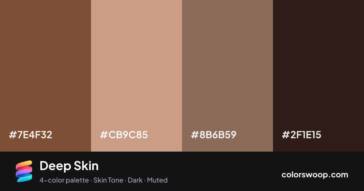
Deep Skin is a dark, monochromatic color palette tagged skin tone, dark, muted. All four colors sit within 3° of hue, so the scheme reads as one color explored across light and dark. Neither washed out nor loud, it adapts to most contexts. The overall temperature is warm.
It works because the lightness range is wide (13% to 66%), which gives clear hierarchy between background, content and accents. Try it for wellness, organic and outdoor brands.
1 of 6 color pairs pass WCAG AA (4.5:1); the strongest is Latte on Raisin at 6.55:1.
A palette preview that turns four colors into a page, so you can judge hierarchy, contrast and mood before you commit.
Primary action SecondaryColor-blind check: all four colors stay distinguishable under protanopia, deuteranopia and tritanopia.
| Pair | Sample | Ratio | Level |
|---|---|---|---|
#CB9C85 on #2F1E15 | Aa | 6.55:1 | AA |
#8B6B59 on #2F1E15 | Aa | 3.3:1 | AA large only |
#7E4F32 on #CB9C85 | Aa | 2.83:1 | Fail |
#7E4F32 on #2F1E15 | Aa | 2.32:1 | Fail |
#CB9C85 on #8B6B59 | Aa | 1.99:1 | Fail |
#7E4F32 on #8B6B59 | Aa | 1.42:1 | Fail |