
#F94144
#F3722C
#F9C74F
#90BE6D
| Swatch | Name | HEX | RGB | HSL | OKLCH |
|---|---|---|---|---|---|
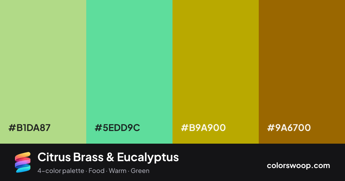
| Celadon | #B1DA87 | rgb(177, 218, 135) | hsl(90, 53%, 69%) | oklch(84.0% 0.118 130) | |
| Eucalyptus | #5EDD9C | rgb(94, 221, 156) | hsl(149, 65%, 62%) | oklch(80.9% 0.147 158) | |
| Brass | #B9A900 | rgb(185, 169, 0) | hsl(55, 100%, 36%) | oklch(72.6% 0.152 103) | |
| Cocoa | #9A6700 | rgb(154, 103, 0) | hsl(40, 100%, 30%) | oklch(55.4% 0.117 75) |
Citrus Brass & Eucalyptus is a vivid split color palette tagged food, warm, green. The hues span about 109°, enough contrast to create a focal point without the harshness of true complements. These are bold, punchy colors that need generous white space around them. The overall temperature is warm.
It works because the lightness steps are gentle (30% to 69%), which keeps the mood consistent from edge to edge. Try it for menus and packaging.
No pair inside the palette reaches 4.5:1, so add black or white for body text.
A palette preview that turns four colors into a page, so you can judge hierarchy, contrast and mood before you commit.
Primary action SecondaryColor-blind check: all four colors stay distinguishable under protanopia, deuteranopia and tritanopia.
| Pair | Sample | Ratio | Level |
|---|---|---|---|
#B1DA87 on #9A6700 | Aa | 3.07:1 | AA large only |
#5EDD9C on #9A6700 | Aa | 2.85:1 | Fail |
#B9A900 on #9A6700 | Aa | 2.03:1 | Fail |
#B1DA87 on #B9A900 | Aa | 1.52:1 | Fail |
#5EDD9C on #B9A900 | Aa | 1.41:1 | Fail |
#B1DA87 on #5EDD9C | Aa | 1.08:1 | Fail |