
#F65840
#E664CF
#FF9427
#FF97B3
| Swatch | Name | HEX | RGB | HSL | OKLCH |
|---|---|---|---|---|---|
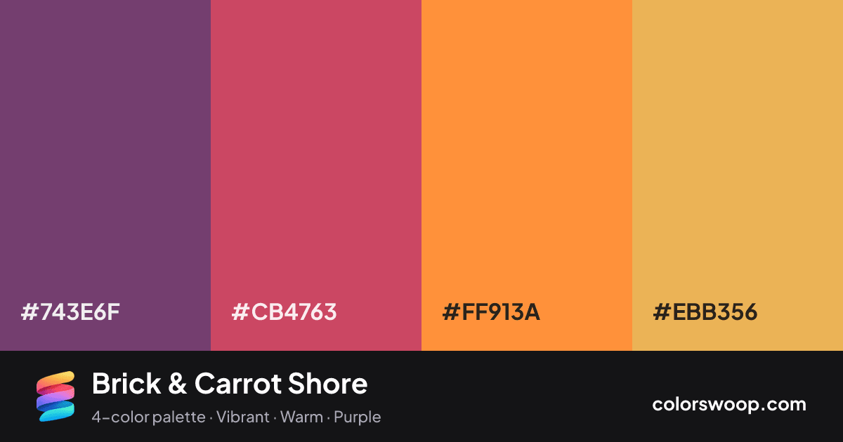
| Plum | #743E6F | rgb(116, 62, 111) | hsl(306, 30%, 35%) | oklch(44.9% 0.101 331) | |
| Brick | #CB4763 | rgb(203, 71, 99) | hsl(347, 56%, 54%) | oklch(58.7% 0.168 11) | |
| Carrot | #FF913A | rgb(255, 145, 58) | hsl(26, 100%, 61%) | oklch(76.1% 0.164 55) | |
| Cantaloupe | #EBB356 | rgb(235, 179, 86) | hsl(37, 79%, 63%) | oklch(80.1% 0.127 78) |
Brick & Carrot Shore is a vivid split color palette tagged vibrant, warm, purple. A split scheme: Plum plays against Cantaloupe across roughly 91° of hue. Saturation runs high, so use the brightest color sparingly and let the others carry the surface area. The overall temperature is warm.
It works because the lightness steps are gentle (35% to 63%), which keeps the mood consistent from edge to edge. Try it for websites, presentations and branding.
No pair inside the palette reaches 4.5:1, so add black or white for body text.
A palette preview that turns four colors into a page, so you can judge hierarchy, contrast and mood before you commit.
Primary action SecondaryColor-blind check: all four colors stay distinguishable under protanopia, deuteranopia and tritanopia.
| Pair | Sample | Ratio | Level |
|---|---|---|---|
#743E6F on #EBB356 | Aa | 4.18:1 | AA large only |
#743E6F on #FF913A | Aa | 3.52:1 | AA large only |
#CB4763 on #EBB356 | Aa | 2.41:1 | Fail |
#CB4763 on #FF913A | Aa | 2.03:1 | Fail |
#743E6F on #CB4763 | Aa | 1.74:1 | Fail |
#FF913A on #EBB356 | Aa | 1.19:1 | Fail |