
#3C096C
#7B2CBF
#C77DFF
#E0AAFF
| Swatch | Name | HEX | RGB | HSL | OKLCH |
|---|---|---|---|---|---|
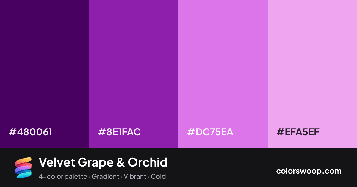
| Indigo | #480061 | rgb(72, 0, 97) | hsl(285, 100%, 19%) | oklch(30.2% 0.150 314) | |
| Grape | #8E1FAC | rgb(142, 31, 172) | hsl(287, 69%, 40%) | oklch(48.8% 0.214 318) | |
| Orchid | #DC75EA | rgb(220, 117, 234) | hsl(293, 74%, 69%) | oklch(72.1% 0.193 323) | |
| Mauve | #EFA5EF | rgb(239, 165, 239) | hsl(300, 70%, 79%) | oklch(81.7% 0.129 327) |
Velvet Grape & Orchid is a vivid monochromatic color palette tagged gradient, vibrant, cold. All four colors sit within 15° of hue, so the scheme reads as one color explored across light and dark. These are bold, punchy colors that need generous white space around them.
With 4 chromatic colors, Orchid takes the lead while the rest support. Lightness runs from 19% to 79%. Well suited to websites, presentations and branding.
2 of 6 color pairs pass WCAG AA (4.5:1); the strongest is Indigo on Mauve at 7.8:1.
A palette preview that turns four colors into a page, so you can judge hierarchy, contrast and mood before you commit.
Primary action SecondaryColor-blind check: all four colors stay distinguishable under protanopia, deuteranopia and tritanopia.
| Pair | Sample | Ratio | Level |
|---|---|---|---|
#480061 on #EFA5EF | Aa | 7.8:1 | AAA |
#480061 on #DC75EA | Aa | 5.37:1 | AA |
#8E1FAC on #EFA5EF | Aa | 3.84:1 | AA large only |
#8E1FAC on #DC75EA | Aa | 2.64:1 | Fail |
#480061 on #8E1FAC | Aa | 2.03:1 | Fail |
#DC75EA on #EFA5EF | Aa | 1.45:1 | Fail |