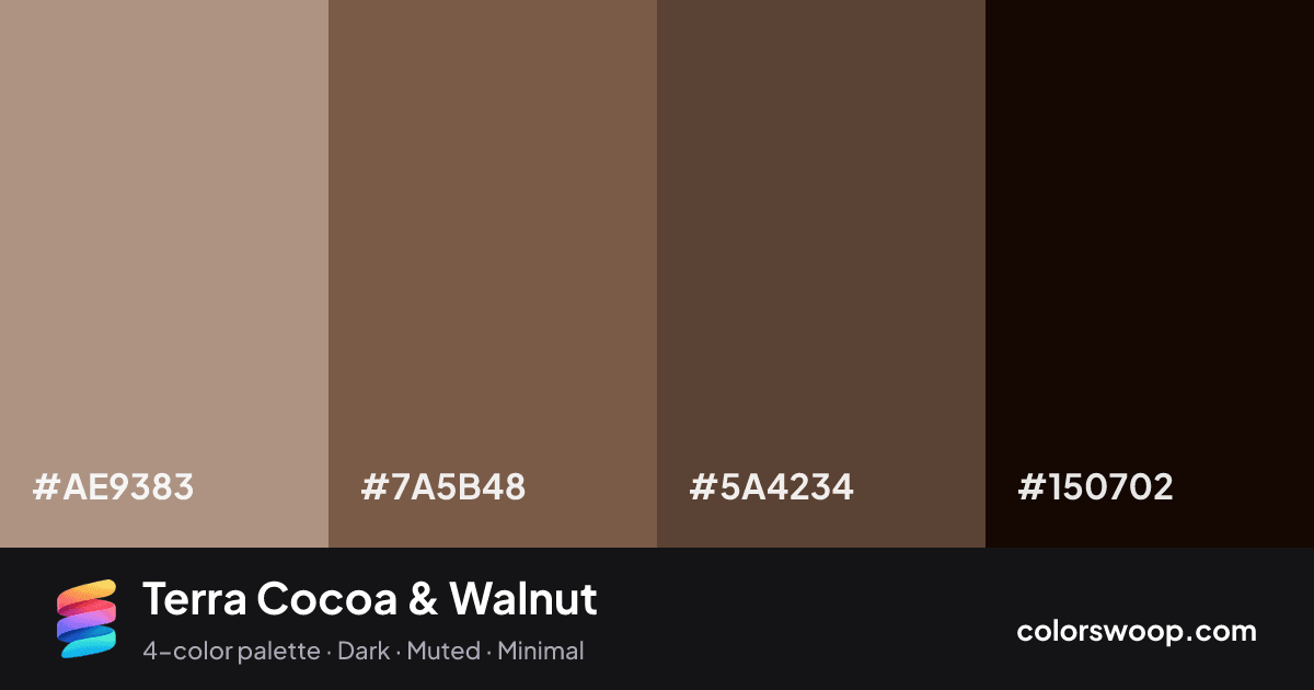
#AE9383Dust
#7A5B48Cocoa
#5A4234Walnut
#150702Obsidian

Terra Cocoa & Walnut color palette

Color codes click any value to copy

SwatchNameHEXRGBHSLOKLCH
Dust#AE9383rgb(174, 147, 131)hsl(22, 21%, 60%)oklch(68.3% 0.040 52)
Cocoa#7A5B48rgb(122, 91, 72)hsl(23, 26%, 38%)oklch(49.8% 0.050 53)
Walnut#5A4234rgb(90, 66, 52)hsl(22, 27%, 28%)oklch(40.1% 0.040 51)
Obsidian#150702rgb(21, 7, 2)hsl(16, 83%, 5%)oklch(14.9% 0.030 49)

Why it works and how to use it

Terra Cocoa & Walnut is a dark, monochromatic color palette tagged dark, muted, minimal. All four colors sit within 1° of hue, so the scheme reads as one color explored across light and dark. Neither washed out nor loud, it adapts to most contexts. The overall temperature is warm.

It works because the lightness range is wide (5% to 60%), which gives clear hierarchy between background, content and accents. Try it for wellness, organic and outdoor brands.

  • Background: Dust (#AE9383) is the lightest color, so it belongs on large surfaces.
  • Text: Obsidian (#150702) on #AE9383 gives 6.87:1, passing WCAG AA.
  • Primary: Walnut (#5A4234) is the most saturated mid-tone; use it for buttons and links (3.23:1 against the background, fine for UI elements).
  • Accent: Cocoa (#7A5B48) for highlights, badges and hover states.

1 of 6 color pairs pass WCAG AA (4.5:1); the strongest is Dust on Obsidian at 6.87:1.

Preview on a real UI see how the palette feels in context

BrandFeaturesPricingBlogGet started

Design faster with Terra Cocoa & Walnut

A palette preview that turns four colors into a page, so you can judge hierarchy, contrast and mood before you commit.

Primary action Secondary
Card title
Card title
Card title
Roles are assigned by lightness.

Color blindness simulation

#AE9383
#7A5B48
#5A4234
#150702

Color-blind check: all four colors stay distinguishable under protanopia, deuteranopia and tritanopia.
Palette card

Terra Cocoa & Walnut color palette card: Dust #AE9383, Cocoa #7A5B48, Walnut #5A4234, Obsidian #150702
Save or share Terra Cocoa & Walnut as an image with its hex codes.

Contrast check WCAG ratios between palette colors

PairSampleRatioLevel
#AE9383 on #150702Aa6.87:1AA
#AE9383 on #5A4234Aa3.23:1AA large only
#7A5B48 on #150702Aa3.21:1AA large only
#AE9383 on #7A5B48Aa2.14:1Fail
#5A4234 on #150702Aa2.13:1Fail
#7A5B48 on #5A4234Aa1.51:1Fail

Similar palettes 24 more in this mood