
#304D7C
#4F78A9
#89B3D6
#E9F1F7
| Swatch | Name | HEX | RGB | HSL | OKLCH |
|---|---|---|---|---|---|
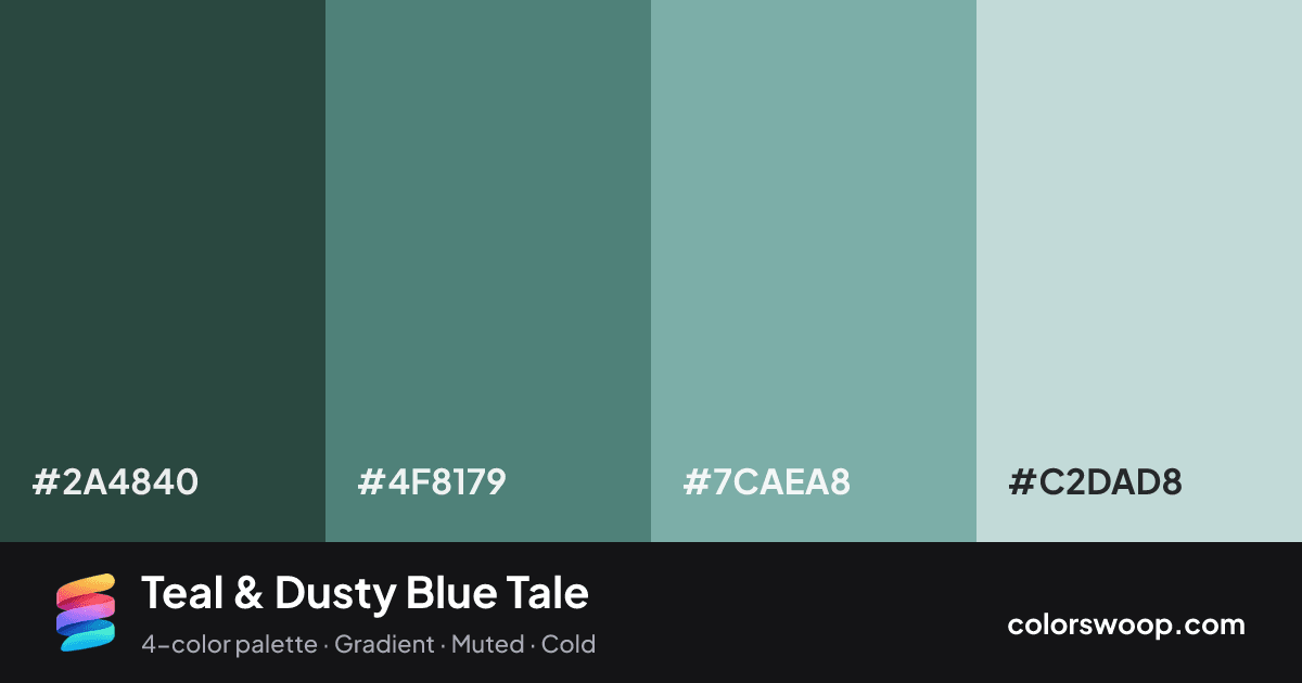
| Charcoal | #2A4840 | rgb(42, 72, 64) | hsl(164, 26%, 22%) | oklch(37.5% 0.039 175) | |
| Teal | #4F8179 | rgb(79, 129, 121) | hsl(170, 24%, 41%) | oklch(56.5% 0.056 183) | |
| Dusty Blue | #7CAEA8 | rgb(124, 174, 168) | hsl(173, 24%, 58%) | oklch(71.4% 0.054 187) | |
| Fog | #C2DAD8 | rgb(194, 218, 216) | hsl(175, 24%, 81%) | oklch(87.0% 0.026 191) |
Teal & Dusty Blue Tale is a monochromatic color palette tagged gradient, muted, cold. All four colors sit within 11° of hue, so the scheme reads as one color explored across light and dark. Neither washed out nor loud, it adapts to most contexts. The overall temperature is cool.
With 4 chromatic colors, Teal takes the lead while the rest support. Lightness runs from 22% to 81%. Well suited to websites, presentations and branding.
1 of 6 color pairs pass WCAG AA (4.5:1); the strongest is Charcoal on Fog at 6.82:1.
A palette preview that turns four colors into a page, so you can judge hierarchy, contrast and mood before you commit.
Primary action SecondaryColor-blind check: all four colors stay distinguishable under protanopia, deuteranopia and tritanopia.
| Pair | Sample | Ratio | Level |
|---|---|---|---|
#2A4840 on #C2DAD8 | Aa | 6.82:1 | AA |
#2A4840 on #7CAEA8 | Aa | 4.04:1 | AA large only |
#4F8179 on #C2DAD8 | Aa | 3.01:1 | AA large only |
#2A4840 on #4F8179 | Aa | 2.26:1 | Fail |
#4F8179 on #7CAEA8 | Aa | 1.79:1 | Fail |
#7CAEA8 on #C2DAD8 | Aa | 1.69:1 | Fail |