
#1E3033
#456578
#98BD9B
#F4FFE6
| Swatch | Name | HEX | RGB | HSL | OKLCH |
|---|---|---|---|---|---|
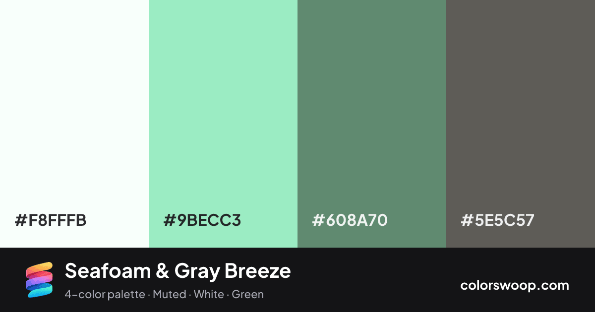
| White | #F8FFFB | rgb(248, 255, 251) | hsl(146, 100%, 99%) | oklch(99.4% 0.009 161) | |
| Seafoam | #9BECC3 | rgb(155, 236, 195) | hsl(150, 68%, 77%) | oklch(88.0% 0.098 161) | |
| Gray | #608A70 | rgb(96, 138, 112) | hsl(143, 18%, 46%) | oklch(59.5% 0.061 157) | |
| Umber | #5E5C57 | rgb(94, 92, 87) | hsl(43, 4%, 35%) | oklch(47.5% 0.008 89) |
Seafoam & Gray Breeze is a monochromatic color palette tagged muted, white, green. All four colors sit within 7° of hue, so the scheme reads as one color explored across light and dark. Neither washed out nor loud, it adapts to most contexts.
The palette holds together thanks to its monochromatic hue relationship and a strong light-to-dark ladder (99% down to 35% lightness). A natural fit for websites, presentations and branding.
2 of 6 color pairs pass WCAG AA (4.5:1); the strongest is White on Umber at 6.58:1.
A palette preview that turns four colors into a page, so you can judge hierarchy, contrast and mood before you commit.
Primary action SecondaryColor-blind check: all four colors stay distinguishable under protanopia, deuteranopia and tritanopia.
| Pair | Sample | Ratio | Level |
|---|---|---|---|
#F8FFFB on #5E5C57 | Aa | 6.58:1 | AA |
#9BECC3 on #5E5C57 | Aa | 4.83:1 | AA |
#F8FFFB on #608A70 | Aa | 3.85:1 | AA large only |
#9BECC3 on #608A70 | Aa | 2.83:1 | Fail |
#608A70 on #5E5C57 | Aa | 1.71:1 | Fail |
#F8FFFB on #9BECC3 | Aa | 1.36:1 | Fail |