
#34032D
#832B74
#BE499C
#FE92AA
| Swatch | Name | HEX | RGB | HSL | OKLCH |
|---|---|---|---|---|---|
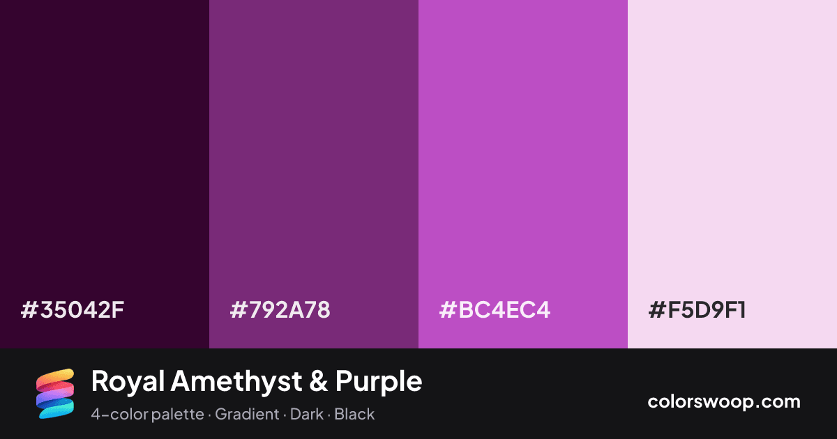
| Raisin | #35042F | rgb(53, 4, 47) | hsl(307, 86%, 11%) | oklch(23.1% 0.094 334) | |
| Purple | #792A78 | rgb(121, 42, 120) | hsl(301, 48%, 32%) | oklch(43.3% 0.147 328) | |
| Amethyst | #BC4EC4 | rgb(188, 78, 196) | hsl(296, 50%, 54%) | oklch(61.2% 0.200 325) | |
| Ballet | #F5D9F1 | rgb(245, 217, 241) | hsl(309, 58%, 91%) | oklch(91.5% 0.044 331) |
Royal Amethyst & Purple is a monochromatic color palette tagged gradient, dark, black. All four colors sit within 13° of hue, so the scheme reads as one color explored across light and dark. Neither washed out nor loud, it adapts to most contexts. The overall temperature is warm.
With 4 chromatic colors, Amethyst takes the lead while the rest support. Lightness runs from 11% to 91%. Well suited to websites, presentations and branding.
2 of 6 color pairs pass WCAG AA (4.5:1); the strongest is Raisin on Ballet at 13.29:1.
A palette preview that turns four colors into a page, so you can judge hierarchy, contrast and mood before you commit.
Primary action SecondaryColor-blind check: all four colors stay distinguishable under protanopia, deuteranopia and tritanopia.
| Pair | Sample | Ratio | Level |
|---|---|---|---|
#35042F on #F5D9F1 | Aa | 13.29:1 | AAA |
#792A78 on #F5D9F1 | Aa | 6.66:1 | AA |
#35042F on #BC4EC4 | Aa | 4.15:1 | AA large only |
#BC4EC4 on #F5D9F1 | Aa | 3.2:1 | AA large only |
#792A78 on #BC4EC4 | Aa | 2.08:1 | Fail |
#35042F on #792A78 | Aa | 2:1 | Fail |