
#74E1CF
#DDCA2D
#5FC588
#82B03D
| Swatch | Name | HEX | RGB | HSL | OKLCH |
|---|---|---|---|---|---|
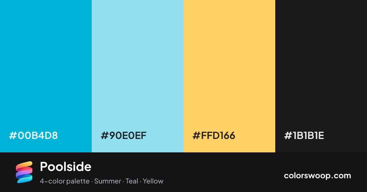
| Cyan | #00B4D8 | rgb(0, 180, 216) | hsl(190, 100%, 42%) | oklch(71.1% 0.129 219) | |
| Powder Blue | #90E0EF | rgb(144, 224, 239) | hsl(189, 75%, 75%) | oklch(86.0% 0.081 211) | |
| Saffron | #FFD166 | rgb(255, 209, 102) | hsl(42, 100%, 70%) | oklch(88.0% 0.135 86) | |
| Raisin | #1B1B1E | rgb(27, 27, 30) | hsl(240, 5%, 11%) | oklch(22.3% 0.006 286) |
Poolside is a vivid complementary color palette tagged summer, teal, yellow. Near-complementary hues (about 148° apart) make this a high-contrast, attention-grabbing combination. Saturation runs high, so use the brightest color sparingly and let the others carry the surface area. Warm and cool hues are mixed, which adds depth.
With 3 chromatic colors, Cyan takes the lead while the rest support. Lightness runs from 11% to 75%. Well suited to websites, presentations and branding.
3 of 6 color pairs pass WCAG AA (4.5:1); the strongest is Saffron on Raisin at 11.92:1.
A palette preview that turns four colors into a page, so you can judge hierarchy, contrast and mood before you commit.
Primary action SecondaryColor-blind check: all four colors stay distinguishable under protanopia, deuteranopia and tritanopia.
| Pair | Sample | Ratio | Level |
|---|---|---|---|
#FFD166 on #1B1B1E | Aa | 11.92:1 | AAA |
#90E0EF on #1B1B1E | Aa | 11.53:1 | AAA |
#00B4D8 on #1B1B1E | Aa | 6.97:1 | AA |
#00B4D8 on #FFD166 | Aa | 1.71:1 | Fail |
#00B4D8 on #90E0EF | Aa | 1.65:1 | Fail |
#90E0EF on #FFD166 | Aa | 1.03:1 | Fail |