
#1D1B1C
#D4C3CD
#AFEC7C
#F5F3F4
| Swatch | Name | HEX | RGB | HSL | OKLCH |
|---|---|---|---|---|---|
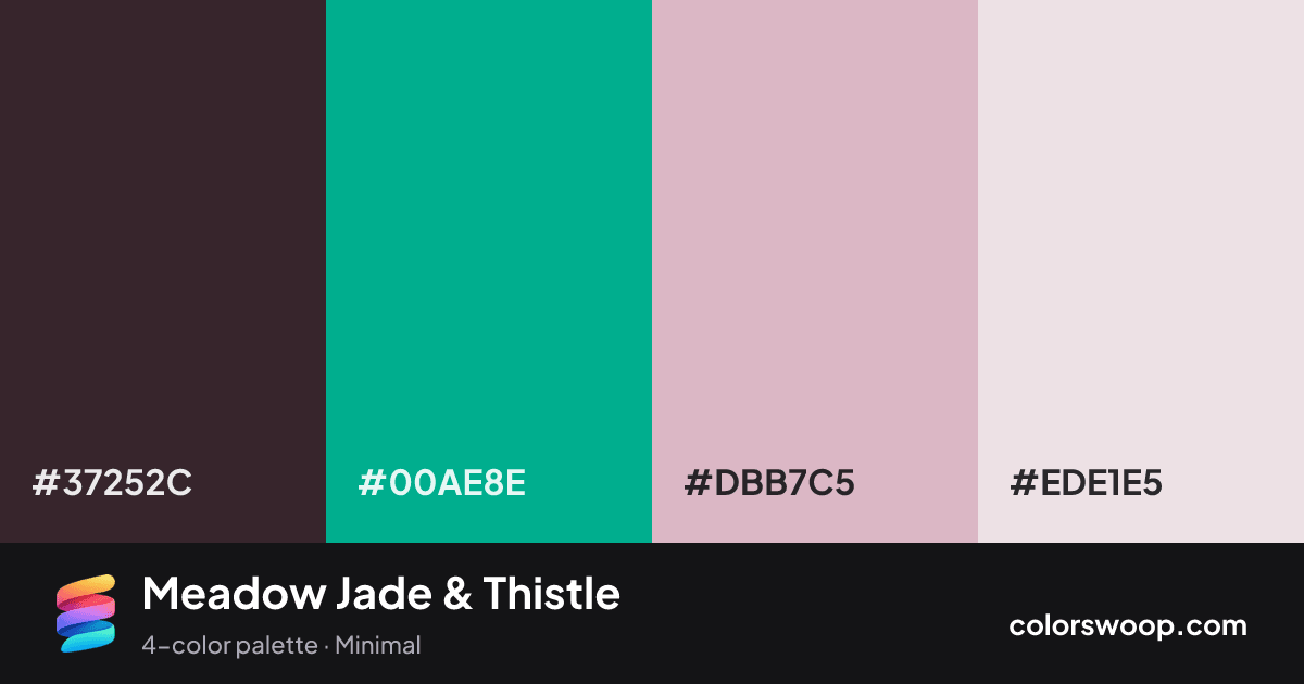
| Espresso | #37252C | rgb(55, 37, 44) | hsl(337, 20%, 18%) | oklch(28.9% 0.030 354) | |
| Jade | #00AE8E | rgb(0, 174, 142) | hsl(169, 100%, 34%) | oklch(66.9% 0.128 173) | |
| Thistle | #DBB7C5 | rgb(219, 183, 197) | hsl(337, 33%, 79%) | oklch(81.5% 0.045 353) | |
| Petal | #EDE1E5 | rgb(237, 225, 229) | hsl(340, 25%, 91%) | oklch(92.0% 0.014 355) |
Meadow Jade & Thistle is a complementary color palette tagged minimal. Espresso and Petal sit nearly opposite on the color wheel, so the pairing has real energy; keep one as the accent. Neither washed out nor loud, it adapts to most contexts. Warm and cool hues are mixed, which adds depth.
With 4 chromatic colors, Jade takes the lead while the rest support. Lightness runs from 18% to 91%. Well suited to websites, presentations and branding.
3 of 6 color pairs pass WCAG AA (4.5:1); the strongest is Espresso on Petal at 11.28:1.
A palette preview that turns four colors into a page, so you can judge hierarchy, contrast and mood before you commit.
Primary action SecondaryColor-blind check: all four colors stay distinguishable under protanopia, deuteranopia and tritanopia.
| Pair | Sample | Ratio | Level |
|---|---|---|---|
#37252C on #EDE1E5 | Aa | 11.28:1 | AAA |
#37252C on #DBB7C5 | Aa | 7.92:1 | AAA |
#37252C on #00AE8E | Aa | 5.09:1 | AA |
#00AE8E on #EDE1E5 | Aa | 2.22:1 | Fail |
#00AE8E on #DBB7C5 | Aa | 1.56:1 | Fail |
#DBB7C5 on #EDE1E5 | Aa | 1.42:1 | Fail |