
#2C1C00
#854010
#BD6263
#EBAAC7
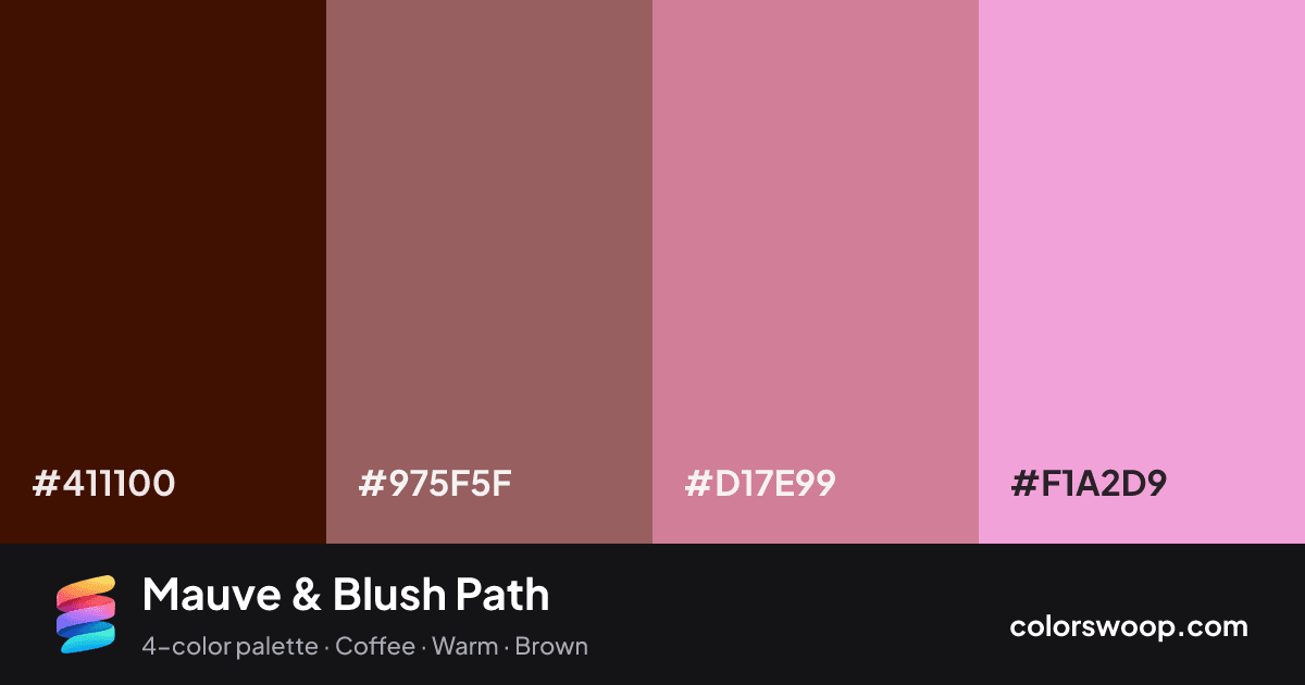
Mauve & Blush Path is an analogous color palette tagged coffee, warm, brown. Analogous neighbors on the wheel (Espresso, Cocoa, Blush) give it a natural, low-tension flow. Saturation is moderate, which keeps it flexible for both interfaces and print. The overall temperature is warm.
The palette holds together thanks to its analogous hue relationship and a strong light-to-dark ladder (79% down to 13% lightness). A natural fit for websites, presentations and branding.
2 of 6 color pairs pass WCAG AA (4.5:1); the strongest is Espresso on Mauve at 8.36:1.
A palette preview that turns four colors into a page, so you can judge hierarchy, contrast and mood before you commit.
Primary action SecondaryColor-blind check: all four colors stay distinguishable under protanopia, deuteranopia and tritanopia.
| Pair | Sample | Ratio | Level |
|---|---|---|---|
#411100 on #F1A2D9 | Aa | 8.36:1 | AAA |
#411100 on #D17E99 | Aa | 5.48:1 | AA |
#411100 on #975F5F | Aa | 3.16:1 | AA large only |
#975F5F on #F1A2D9 | Aa | 2.65:1 | Fail |
#975F5F on #D17E99 | Aa | 1.74:1 | Fail |
#D17E99 on #F1A2D9 | Aa | 1.52:1 | Fail |