
#907A00
#AD9A44
#D9BB00
#F3E345
| Swatch | Name | HEX | RGB | HSL | OKLCH |
|---|---|---|---|---|---|
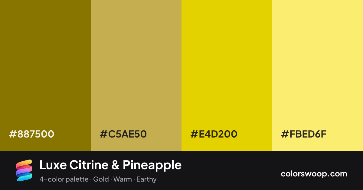
| Olive | #887500 | rgb(136, 117, 0) | hsl(52, 100%, 27%) | oklch(56.3% 0.116 98) | |
| Brass | #C5AE50 | rgb(197, 174, 80) | hsl(48, 50%, 54%) | oklch(75.2% 0.117 96) | |
| Citrine | #E4D200 | rgb(228, 210, 0) | hsl(55, 100%, 45%) | oklch(85.2% 0.179 103) | |
| Pineapple | #FBED6F | rgb(251, 237, 111) | hsl(54, 95%, 71%) | oklch(93.3% 0.147 103) |
Luxe Citrine & Pineapple is a vivid monochromatic color palette tagged gold, warm, earthy. All four colors sit within 7° of hue, so the scheme reads as one color explored across light and dark. These are bold, punchy colors that need generous white space around them. The overall temperature is warm.
With 4 chromatic colors, Citrine takes the lead while the rest support. Lightness runs from 27% to 71%. Well suited to premium branding and packaging.
No pair inside the palette reaches 4.5:1, so add black or white for body text.
A palette preview that turns four colors into a page, so you can judge hierarchy, contrast and mood before you commit.
Primary action SecondaryColor-blind check: under tritanopia, Citrine and Pineapple become hard to tell apart, so do not rely on that pair alone to carry meaning.
| Pair | Sample | Ratio | Level |
|---|---|---|---|
#887500 on #FBED6F | Aa | 3.8:1 | AA large only |
#887500 on #E4D200 | Aa | 2.94:1 | Fail |
#887500 on #C5AE50 | Aa | 2.08:1 | Fail |
#C5AE50 on #FBED6F | Aa | 1.83:1 | Fail |
#C5AE50 on #E4D200 | Aa | 1.42:1 | Fail |
#E4D200 on #FBED6F | Aa | 1.29:1 | Fail |