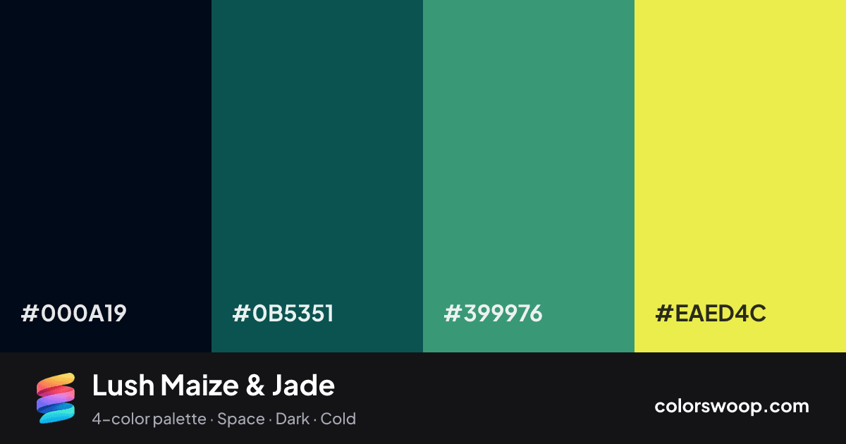
#000A19Obsidian
#0B5351Spruce
#399976Jade
#EAED4CMaize

Lush Maize & Jade color palette

Color codes click any value to copy

SwatchNameHEXRGBHSLOKLCH
Obsidian#000A19rgb(0, 10, 25)hsl(216, 100%, 5%)oklch(14.2% 0.040 249)
Spruce#0B5351rgb(11, 83, 81)hsl(178, 77%, 18%)oklch(40.1% 0.065 192)
Jade#399976rgb(57, 153, 118)hsl(158, 46%, 41%)oklch(61.7% 0.105 166)
Maize#EAED4Crgb(234, 237, 76)hsl(61, 82%, 61%)oklch(91.6% 0.175 110)

Why it works and how to use it

Lush Maize & Jade is a vivid dark, split color palette tagged space, dark, cold. The hues span about 117°, enough contrast to create a focal point without the harshness of true complements. These are bold, punchy colors that need generous white space around them. Warm and cool hues are mixed, which adds depth.

With 3 chromatic colors, Spruce takes the lead while the rest support. Lightness runs from 5% to 61%. Well suited to dark-mode interfaces and gaming.

  • Background: Maize (#EAED4C) is the lightest color, so it belongs on large surfaces.
  • Text: Obsidian (#000A19) on #EAED4C gives 15.81:1, passing WCAG AAA.
  • Primary: Spruce (#0B5351) is the most saturated mid-tone; use it for buttons and links (7.05:1 against the background, fine for UI elements).
  • Accent: Jade (#399976) for highlights, badges and hover states.

3 of 6 color pairs pass WCAG AA (4.5:1); the strongest is Obsidian on Maize at 15.81:1.

Preview on a real UI see how the palette feels in context

BrandFeaturesPricingBlogGet started

Design faster with Lush Maize & Jade

A palette preview that turns four colors into a page, so you can judge hierarchy, contrast and mood before you commit.

Primary action Secondary
Card title
Card title
Card title
Roles are assigned by lightness.

Color blindness simulation

#000A19
#0B5351
#399976
#EAED4C

Color-blind check: all four colors stay distinguishable under protanopia, deuteranopia and tritanopia.
Palette card

Lush Maize & Jade color palette card: Obsidian #000A19, Spruce #0B5351, Jade #399976, Maize #EAED4C
Save or share Lush Maize & Jade as an image with its hex codes.

Contrast check WCAG ratios between palette colors

PairSampleRatioLevel
#000A19 on #EAED4CAa15.81:1AAA
#0B5351 on #EAED4CAa7.05:1AAA
#000A19 on #399976Aa5.67:1AA
#399976 on #EAED4CAa2.79:1Fail
#0B5351 on #399976Aa2.53:1Fail
#000A19 on #0B5351Aa2.24:1Fail

Similar palettes 24 more in this mood