
#FF8C00
#FFD23F
#8CC63F
#FFFFFF
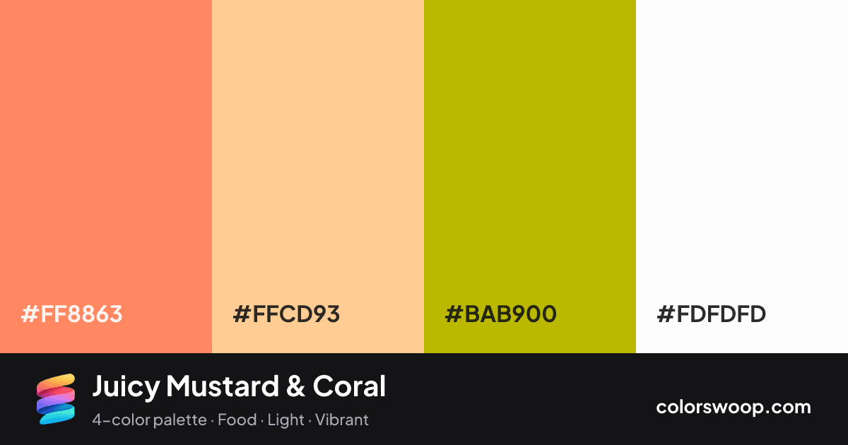
Juicy Mustard & Coral is a vivid analogous color palette tagged food, light, vibrant. Analogous neighbors on the wheel (Coral, Apricot, Mustard) give it a natural, low-tension flow. Saturation runs high, so use the brightest color sparingly and let the others carry the surface area. The overall temperature is warm.
With 3 chromatic colors, Apricot takes the lead while the rest support. Lightness runs from 36% to 99%. Well suited to menus and packaging.
No pair inside the palette reaches 4.5:1, so add black or white for body text.
A palette preview that turns four colors into a page, so you can judge hierarchy, contrast and mood before you commit.
Primary action SecondaryColor-blind check: under deuteranopia, Coral and Mustard become hard to tell apart, so do not rely on that pair alone to carry meaning.
| Pair | Sample | Ratio | Level |
|---|---|---|---|
#FF8863 on #FDFDFD | Aa | 2.31:1 | Fail |
#BAB900 on #FDFDFD | Aa | 2.06:1 | Fail |
#FF8863 on #FFCD93 | Aa | 1.61:1 | Fail |
#FFCD93 on #BAB900 | Aa | 1.44:1 | Fail |
#FFCD93 on #FDFDFD | Aa | 1.43:1 | Fail |
#FF8863 on #BAB900 | Aa | 1.12:1 | Fail |