
#2B2B2B
#4A4A4A
#A6E22E
#F5F5F5
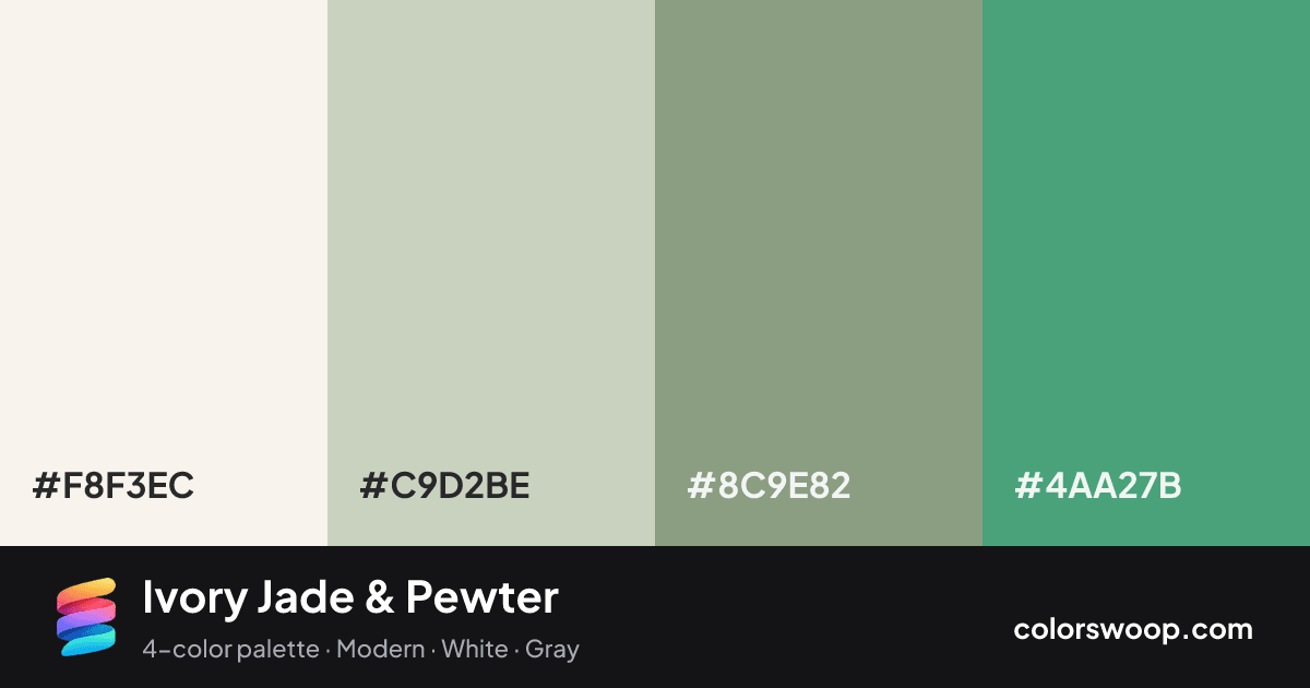
Ivory Jade & Pewter is an analogous color palette tagged modern, white, gray. The hues stay within 66° of each other on the color wheel, which is why the palette feels cohesive rather than busy. Neither washed out nor loud, it adapts to most contexts. Warm and cool hues are mixed, which adds depth.
Two of the four colors are near-neutral, which leaves room for Fog to lead. Lightness runs from 46% to 95%. Well suited to websites, presentations and branding.
No pair inside the palette reaches 4.5:1, so add black or white for body text.
A palette preview that turns four colors into a page, so you can judge hierarchy, contrast and mood before you commit.
Primary action SecondaryColor-blind check: all four colors stay distinguishable under protanopia, deuteranopia and tritanopia.
| Pair | Sample | Ratio | Level |
|---|---|---|---|
#F8F3EC on #4AA27B | Aa | 2.82:1 | Fail |
#F8F3EC on #8C9E82 | Aa | 2.6:1 | Fail |
#C9D2BE on #4AA27B | Aa | 1.99:1 | Fail |
#C9D2BE on #8C9E82 | Aa | 1.83:1 | Fail |
#F8F3EC on #C9D2BE | Aa | 1.41:1 | Fail |
#8C9E82 on #4AA27B | Aa | 1.09:1 | Fail |