
#F1EFE7
#D9D4C7
#8C8A82
#2F2F2F
| Swatch | Name | HEX | RGB | HSL | OKLCH |
|---|---|---|---|---|---|
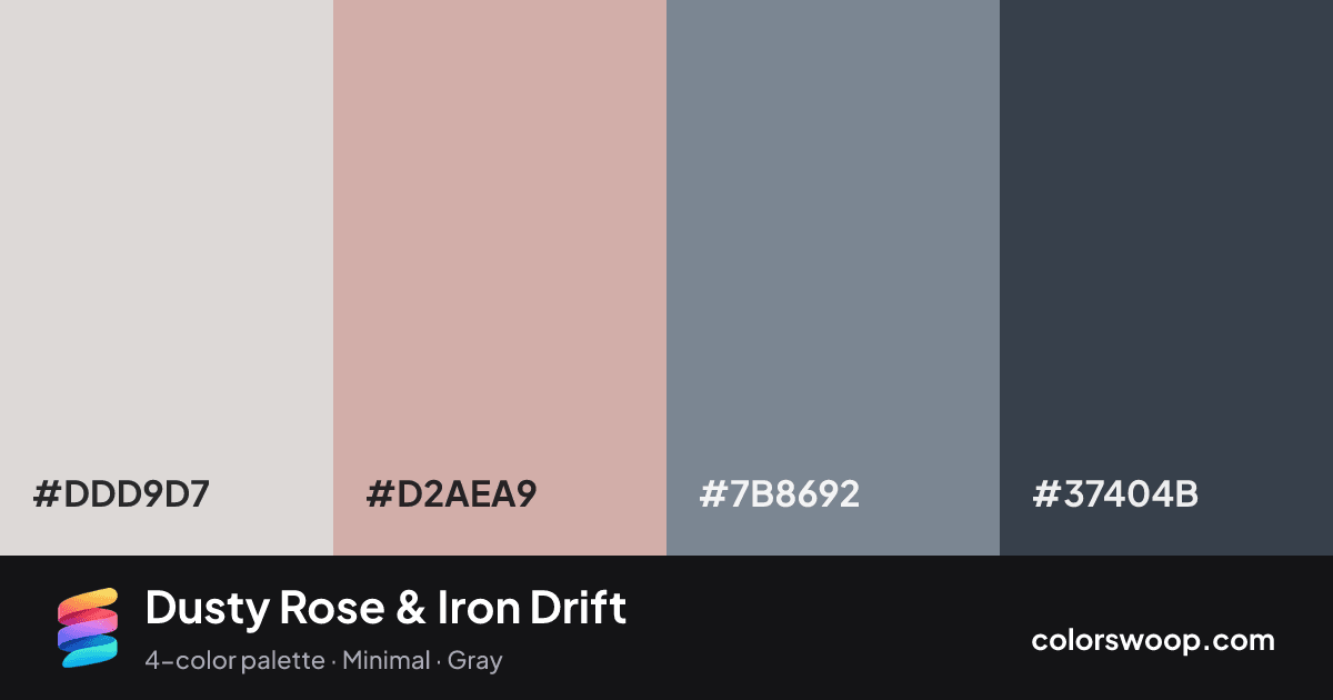
| Bone | #DDD9D7 | rgb(221, 217, 215) | hsl(20, 8%, 85%) | oklch(88.8% 0.005 49) | |
| Dusty Rose | #D2AEA9 | rgb(210, 174, 169) | hsl(7, 31%, 74%) | oklch(78.1% 0.043 27) | |
| Slate | #7B8692 | rgb(123, 134, 146) | hsl(211, 10%, 53%) | oklch(61.5% 0.022 251) | |
| Iron | #37404B | rgb(55, 64, 75) | hsl(213, 15%, 25%) | oklch(36.8% 0.022 254) |
Dusty Rose & Iron Drift is a muted neutral-based color palette tagged minimal, gray. Dusty Rose is the only saturated color here, so it does all the talking against a neutral base. Every color is softened, so it works well as a background system for text-heavy layouts.
Two of the four colors are near-neutral, which leaves room for Dusty Rose to lead. Lightness runs from 25% to 85%. Well suited to websites, presentations and branding.
2 of 6 color pairs pass WCAG AA (4.5:1); the strongest is Bone on Iron at 7.5:1.
A palette preview that turns four colors into a page, so you can judge hierarchy, contrast and mood before you commit.
Primary action SecondaryColor-blind check: all four colors stay distinguishable under protanopia, deuteranopia and tritanopia.
| Pair | Sample | Ratio | Level |
|---|---|---|---|
#DDD9D7 on #37404B | Aa | 7.5:1 | AAA |
#D2AEA9 on #37404B | Aa | 5.19:1 | AA |
#7B8692 on #37404B | Aa | 2.84:1 | Fail |
#DDD9D7 on #7B8692 | Aa | 2.64:1 | Fail |
#D2AEA9 on #7B8692 | Aa | 1.83:1 | Fail |
#DDD9D7 on #D2AEA9 | Aa | 1.44:1 | Fail |