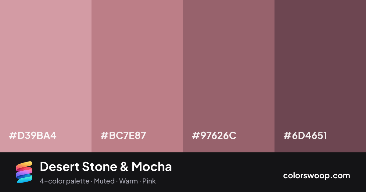
#D39BA4Lilac
#BC7E87Stone
#97626CMocha
#6D4651Eggplant

Desert Stone & Mocha color palette

Color codes click any value to copy

SwatchNameHEXRGBHSLOKLCH
Lilac#D39BA4rgb(211, 155, 164)hsl(350, 39%, 72%)oklch(74.5% 0.068 8)
Stone#BC7E87rgb(188, 126, 135)hsl(351, 32%, 62%)oklch(65.9% 0.078 10)
Mocha#97626Crgb(151, 98, 108)hsl(349, 21%, 49%)oklch(55.6% 0.070 7)
Eggplant#6D4651rgb(109, 70, 81)hsl(343, 22%, 35%)oklch(44.2% 0.056 1)

Why it works and how to use it

Desert Stone & Mocha is a monochromatic color palette tagged muted, warm, pink. All four colors sit within 8° of hue, so the scheme reads as one color explored across light and dark. Neither washed out nor loud, it adapts to most contexts. The overall temperature is warm.

With 4 chromatic colors, Stone takes the lead while the rest support. Lightness runs from 35% to 72%. Well suited to websites, presentations and branding.

  • Background: Lilac (#D39BA4) is the lightest color, so it belongs on large surfaces.
  • Text: Eggplant (#6D4651) on #D39BA4 gives 3.4:1, enough for large headings only.
  • Primary: Stone (#BC7E87) is the most saturated mid-tone; use it for buttons and links with a border or a darker shade for contrast.
  • Accent: Mocha (#97626C) for highlights, badges and hover states.

No pair inside the palette reaches 4.5:1, so add black or white for body text.

Preview on a real UI see how the palette feels in context

BrandFeaturesPricingBlogGet started

Design faster with Desert Stone & Mocha

A palette preview that turns four colors into a page, so you can judge hierarchy, contrast and mood before you commit.

Primary action Secondary
Card title
Card title
Card title
Roles are assigned by lightness.

Color blindness simulation

#D39BA4
#BC7E87
#97626C
#6D4651

Color-blind check: all four colors stay distinguishable under protanopia, deuteranopia and tritanopia.
Palette card

Desert Stone & Mocha color palette card: Lilac #D39BA4, Stone #BC7E87, Mocha #97626C, Eggplant #6D4651
Save or share Desert Stone & Mocha as an image with its hex codes.

Contrast check WCAG ratios between palette colors

PairSampleRatioLevel
#D39BA4 on #6D4651Aa3.4:1AA large only
#BC7E87 on #6D4651Aa2.45:1Fail
#D39BA4 on #97626CAa2.1:1Fail
#97626C on #6D4651Aa1.62:1Fail
#BC7E87 on #97626CAa1.51:1Fail
#D39BA4 on #BC7E87Aa1.39:1Fail

Similar palettes 24 more in this mood