
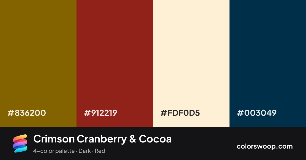
#B3001B
#E63946
#F8E9E9
#1D1D1D
| Swatch | Name | HEX | RGB | HSL | OKLCH |
|---|---|---|---|---|---|
| Cocoa | #836200 | rgb(131, 98, 0) | hsl(45, 100%, 26%) | oklch(51.6% 0.106 85) | |
| Cranberry | #912219 | rgb(145, 34, 25) | hsl(5, 71%, 33%) | oklch(43.4% 0.148 29) | |
| Papaya | #FDF0D5 | rgb(253, 240, 213) | hsl(40, 91%, 91%) | oklch(95.8% 0.038 85) | |
| Prussian Blue | #003049 | rgb(0, 48, 73) | hsl(201, 100%, 14%) | oklch(29.4% 0.066 238) |
Crimson Cranberry & Cocoa is a vivid complementary color palette tagged dark, red. Cocoa and Prussian Blue sit nearly opposite on the color wheel, so the pairing has real energy; keep one as the accent. These are bold, punchy colors that need generous white space around them. Warm and cool hues are mixed, which adds depth.
With 4 chromatic colors, Cocoa takes the lead while the rest support. Lightness runs from 14% to 91%. Well suited to websites, presentations and branding.
3 of 6 color pairs pass WCAG AA (4.5:1); the strongest is Papaya on Prussian Blue at 12.25:1.
A palette preview that turns four colors into a page, so you can judge hierarchy, contrast and mood before you commit.
Primary action SecondaryColor-blind check: all four colors stay distinguishable under protanopia, deuteranopia and tritanopia.
| Pair | Sample | Ratio | Level |
|---|---|---|---|
#FDF0D5 on #003049 | Aa | 12.25:1 | AAA |
#912219 on #FDF0D5 | Aa | 7.6:1 | AAA |
#836200 on #FDF0D5 | Aa | 5.01:1 | AA |
#836200 on #003049 | Aa | 2.44:1 | Fail |
#912219 on #003049 | Aa | 1.61:1 | Fail |
#836200 on #912219 | Aa | 1.52:1 | Fail |