
#C6CD7D
#EA8D6D
#A59775
#864D00
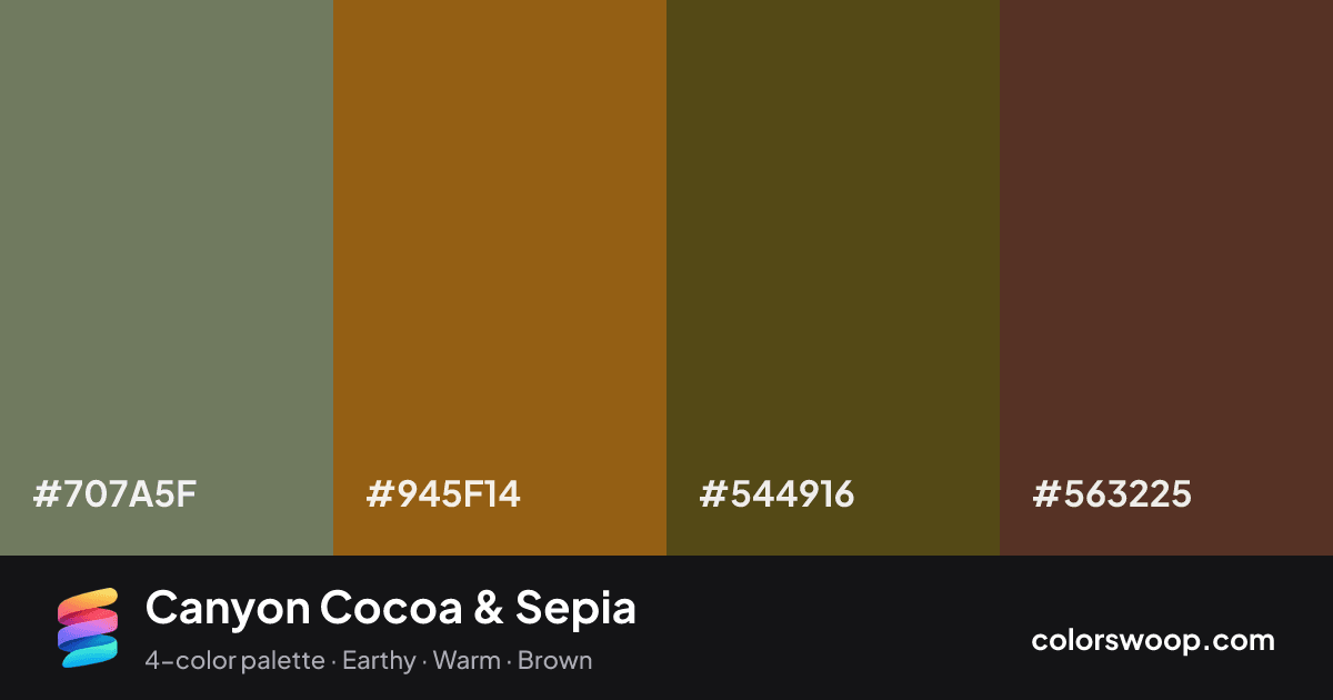
Canyon Cocoa & Sepia is a dark, analogous color palette tagged earthy, warm, brown. Analogous neighbors on the wheel (Cocoa, Sepia, Taupe) give it a natural, low-tension flow. Saturation is moderate, which keeps it flexible for both interfaces and print. The overall temperature is warm.
With 3 chromatic colors, Cocoa takes the lead while the rest support. Lightness runs from 21% to 43%. Well suited to wellness, organic and outdoor brands.
No pair inside the palette reaches 4.5:1, so add black or white for body text.
A palette preview that turns four colors into a page, so you can judge hierarchy, contrast and mood before you commit.
Primary action SecondaryColor-blind check: under deuteranopia, Shadow and Cocoa become hard to tell apart, so do not rely on that pair alone to carry meaning.
| Pair | Sample | Ratio | Level |
|---|---|---|---|
#707A5F on #563225 | Aa | 2.47:1 | Fail |
#945F14 on #563225 | Aa | 2.08:1 | Fail |
#707A5F on #544916 | Aa | 1.98:1 | Fail |
#945F14 on #544916 | Aa | 1.67:1 | Fail |
#544916 on #563225 | Aa | 1.25:1 | Fail |
#707A5F on #945F14 | Aa | 1.19:1 | Fail |