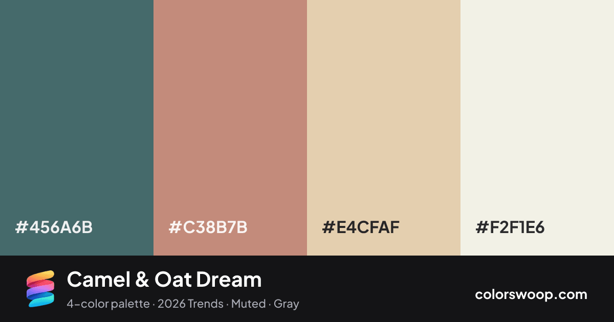
#456A6BStorm
#C38B7BCamel
#E4CFAFOat
#F2F1E6Linen

Camel & Oat Dream color palette

Color codes click any value to copy

SwatchNameHEXRGBHSLOKLCH
Storm#456A6Brgb(69, 106, 107)hsl(182, 22%, 35%)oklch(49.7% 0.042 198)
Camel#C38B7Brgb(195, 139, 123)hsl(13, 37%, 62%)oklch(68.8% 0.073 37)
Oat#E4CFAFrgb(228, 207, 175)hsl(36, 50%, 79%)oklch(86.4% 0.049 78)
Linen#F2F1E6rgb(242, 241, 230)hsl(55, 32%, 93%)oklch(95.6% 0.015 102)

Why it works and how to use it

Camel & Oat Dream is a complementary color palette tagged 2026 trends, muted, gray. Near-complementary hues (about 169° apart) make this a high-contrast, attention-grabbing combination. Saturation is moderate, which keeps it flexible for both interfaces and print. Warm and cool hues are mixed, which adds depth.

With 4 chromatic colors, Oat takes the lead while the rest support. Lightness runs from 35% to 93%. Well suited to websites, presentations and branding.

  • Background: Linen (#F2F1E6) is the lightest color, so it belongs on large surfaces.
  • Text: Storm (#456A6B) on #F2F1E6 gives 5.25:1, passing WCAG AA.
  • Primary: Oat (#E4CFAF) is the most saturated mid-tone; use it for buttons and links with a border or a darker shade for contrast.
  • Accent: Camel (#C38B7B) for highlights, badges and hover states.

1 of 6 color pairs pass WCAG AA (4.5:1); the strongest is Storm on Linen at 5.25:1.

Preview on a real UI see how the palette feels in context

BrandFeaturesPricingBlogGet started

Design faster with Camel & Oat Dream

A palette preview that turns four colors into a page, so you can judge hierarchy, contrast and mood before you commit.

Primary action Secondary
Card title
Card title
Card title
Roles are assigned by lightness.

Color blindness simulation

#456A6B
#C38B7B
#E4CFAF
#F2F1E6

Color-blind check: all four colors stay distinguishable under protanopia, deuteranopia and tritanopia.
Palette card

Camel & Oat Dream color palette card: Storm #456A6B, Camel #C38B7B, Oat #E4CFAF, Linen #F2F1E6
Save or share Camel & Oat Dream as an image with its hex codes.

Contrast check WCAG ratios between palette colors

PairSampleRatioLevel
#456A6B on #F2F1E6Aa5.25:1AA
#456A6B on #E4CFAFAa3.92:1AA large only
#C38B7B on #F2F1E6Aa2.53:1Fail
#456A6B on #C38B7BAa2.07:1Fail
#C38B7B on #E4CFAFAa1.9:1Fail
#E4CFAF on #F2F1E6Aa1.34:1Fail

Similar palettes 24 more in this mood