
#5C8D89
#A7D7C5
#F4F9F4
#F2C57C
| Swatch | Name | HEX | RGB | HSL | OKLCH |
|---|---|---|---|---|---|
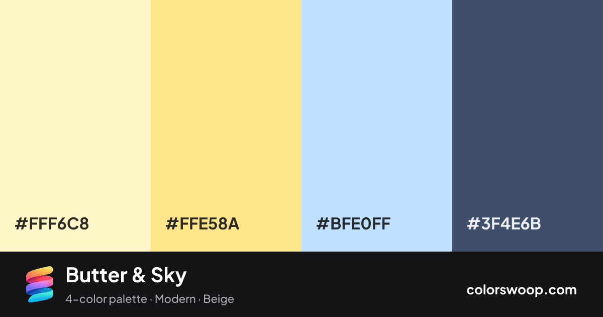
| Cream | #FFF6C8 | rgb(255, 246, 200) | hsl(50, 100%, 89%) | oklch(96.9% 0.060 98) | |
| Vanilla | #FFE58A | rgb(255, 229, 138) | hsl(47, 100%, 77%) | oklch(92.4% 0.115 94) | |
| Glacier | #BFE0FF | rgb(191, 224, 255) | hsl(209, 100%, 87%) | oklch(89.3% 0.055 247) | |
| Dusk | #3F4E6B | rgb(63, 78, 107) | hsl(220, 26%, 33%) | oklch(42.4% 0.052 263) |
Butter & Sky is a vivid complementary color palette tagged modern, beige. Cream and Dusk sit nearly opposite on the color wheel, so the pairing has real energy; keep one as the accent. These are bold, punchy colors that need generous white space around them. Warm and cool hues are mixed, which adds depth.
With 4 chromatic colors, Vanilla takes the lead while the rest support. Lightness runs from 33% to 89%. Well suited to websites, presentations and branding.
3 of 6 color pairs pass WCAG AA (4.5:1); the strongest is Cream on Dusk at 7.67:1.
A palette preview that turns four colors into a page, so you can judge hierarchy, contrast and mood before you commit.
Primary action SecondaryColor-blind check: all four colors stay distinguishable under protanopia, deuteranopia and tritanopia.
| Pair | Sample | Ratio | Level |
|---|---|---|---|
#FFF6C8 on #3F4E6B | Aa | 7.67:1 | AAA |
#FFE58A on #3F4E6B | Aa | 6.69:1 | AA |
#BFE0FF on #3F4E6B | Aa | 6.1:1 | AA |
#FFF6C8 on #BFE0FF | Aa | 1.26:1 | Fail |
#FFF6C8 on #FFE58A | Aa | 1.15:1 | Fail |
#FFE58A on #BFE0FF | Aa | 1.1:1 | Fail |