
#D96C2C
#E9B44C
#8C5E2A
#F5E8C7
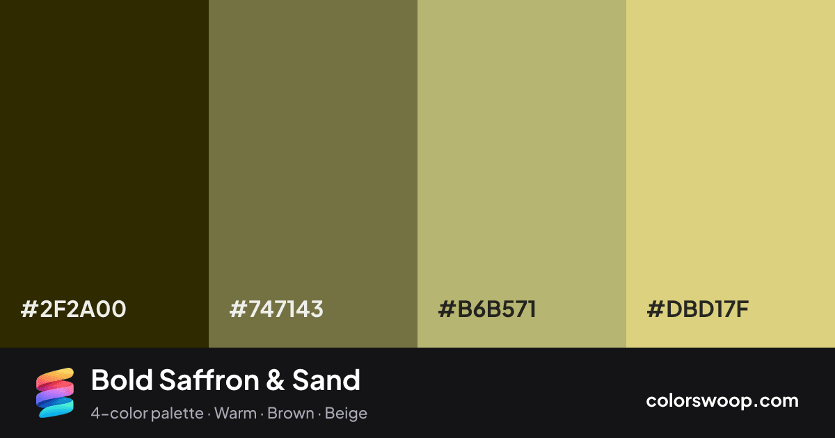
| Swatch | Name | HEX | RGB | HSL | OKLCH |
|---|---|---|---|---|---|
| Espresso | #2F2A00 | rgb(47, 42, 0) | hsl(54, 100%, 9%) | oklch(28.2% 0.059 103) | |
| Shadow | #747143 | rgb(116, 113, 67) | hsl(56, 27%, 36%) | oklch(54.0% 0.065 105) | |
| Sand | #B6B571 | rgb(182, 181, 113) | hsl(59, 32%, 58%) | oklch(75.8% 0.089 108) | |
| Saffron | #DBD17F | rgb(219, 209, 127) | hsl(53, 56%, 68%) | oklch(85.1% 0.104 102) |
Bold Saffron & Sand is a monochromatic color palette tagged warm, brown, beige. All four colors sit within 6° of hue, so the scheme reads as one color explored across light and dark. Neither washed out nor loud, it adapts to most contexts. The overall temperature is warm.
With 4 chromatic colors, Sand takes the lead while the rest support. Lightness runs from 9% to 68%. Well suited to websites, presentations and branding.
2 of 6 color pairs pass WCAG AA (4.5:1); the strongest is Espresso on Saffron at 9.25:1.
A palette preview that turns four colors into a page, so you can judge hierarchy, contrast and mood before you commit.
Primary action SecondaryColor-blind check: all four colors stay distinguishable under protanopia, deuteranopia and tritanopia.
| Pair | Sample | Ratio | Level |
|---|---|---|---|
#2F2A00 on #DBD17F | Aa | 9.25:1 | AAA |
#2F2A00 on #B6B571 | Aa | 6.77:1 | AA |
#747143 on #DBD17F | Aa | 3.21:1 | AA large only |
#2F2A00 on #747143 | Aa | 2.88:1 | Fail |
#747143 on #B6B571 | Aa | 2.35:1 | Fail |
#B6B571 on #DBD17F | Aa | 1.37:1 | Fail |