
#12071A
#582C66
#FF2E9A
#FFD1E8
| Swatch | Name | HEX | RGB | HSL | OKLCH |
|---|---|---|---|---|---|
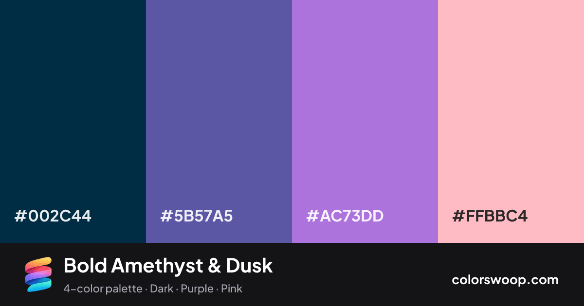
| Prussian Blue | #002C44 | rgb(0, 44, 68) | hsl(201, 100%, 13%) | oklch(27.9% 0.063 239) | |
| Dusk | #5B57A5 | rgb(91, 87, 165) | hsl(243, 31%, 49%) | oklch(49.9% 0.122 283) | |
| Amethyst | #AC73DD | rgb(172, 115, 221) | hsl(272, 61%, 66%) | oklch(65.8% 0.161 307) | |
| Pink | #FFBBC4 | rgb(255, 187, 196) | hsl(352, 100%, 87%) | oklch(85.7% 0.079 10) |
Bold Amethyst & Dusk is a vivid complementary color palette tagged dark, purple, pink. Near-complementary hues (about 151° apart) make this a high-contrast, attention-grabbing combination. Saturation runs high, so use the brightest color sparingly and let the others carry the surface area. Warm and cool hues are mixed, which adds depth.
With 4 chromatic colors, Amethyst takes the lead while the rest support. Lightness runs from 13% to 87%. Well suited to websites, presentations and branding.
1 of 6 color pairs pass WCAG AA (4.5:1); the strongest is Prussian Blue on Pink at 9.11:1.
A palette preview that turns four colors into a page, so you can judge hierarchy, contrast and mood before you commit.
Primary action SecondaryColor-blind check: all four colors stay distinguishable under protanopia, deuteranopia and tritanopia.
| Pair | Sample | Ratio | Level |
|---|---|---|---|
#002C44 on #FFBBC4 | Aa | 9.11:1 | AAA |
#002C44 on #AC73DD | Aa | 4.33:1 | AA large only |
#5B57A5 on #FFBBC4 | Aa | 3.93:1 | AA large only |
#002C44 on #5B57A5 | Aa | 2.32:1 | Fail |
#AC73DD on #FFBBC4 | Aa | 2.1:1 | Fail |
#5B57A5 on #AC73DD | Aa | 1.87:1 | Fail |