
#0E3B4A
#1F7A8C
#8FD5D2
#EAF7F5
| Swatch | Name | HEX | RGB | HSL | OKLCH |
|---|---|---|---|---|---|
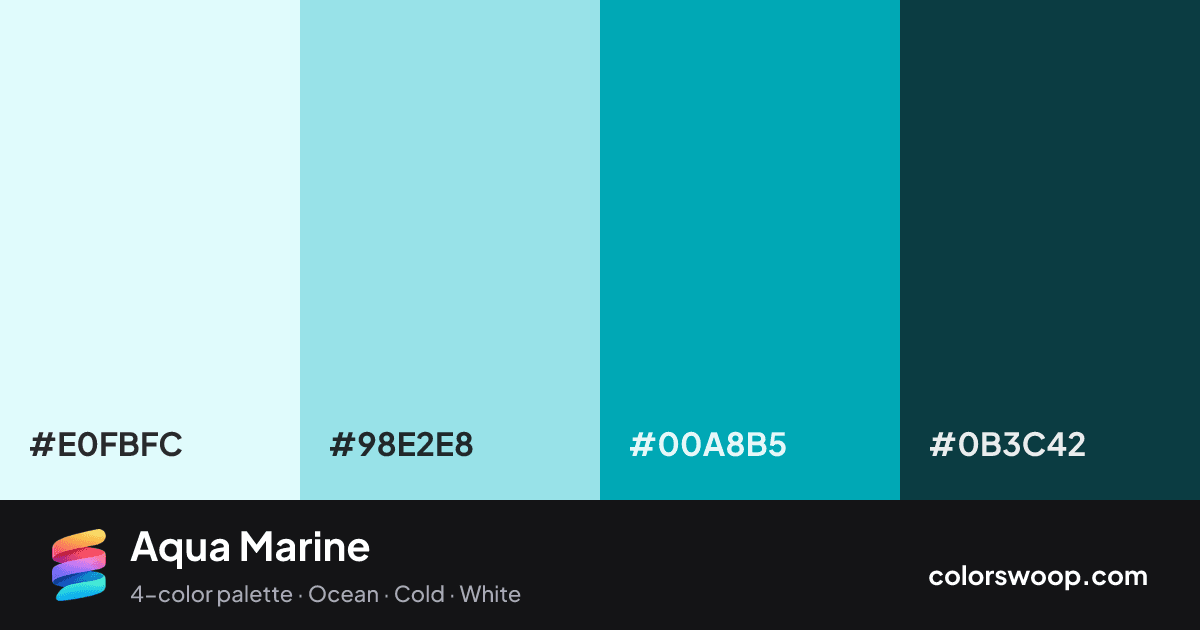
| Frost | #E0FBFC | rgb(224, 251, 252) | hsl(182, 82%, 93%) | oklch(96.9% 0.028 199) | |
| Powder Blue | #98E2E8 | rgb(152, 226, 232) | hsl(185, 63%, 75%) | oklch(86.6% 0.074 202) | |
| Cadet | #00A8B5 | rgb(0, 168, 181) | hsl(184, 100%, 35%) | oklch(66.7% 0.114 205) | |
| Gunmetal | #0B3C42 | rgb(11, 60, 66) | hsl(187, 71%, 15%) | oklch(32.8% 0.051 207) |
Aqua Marine is a vivid monochromatic color palette tagged ocean, cold, white. A monochromatic set: the same hue family from Gunmetal down to Frost. Saturation runs high, so use the brightest color sparingly and let the others carry the surface area. The overall temperature is cool.
It works because the lightness range is wide (15% to 93%), which gives clear hierarchy between background, content and accents. Try it for websites, presentations and branding.
2 of 6 color pairs pass WCAG AA (4.5:1); the strongest is Frost on Gunmetal at 11.14:1.
A palette preview that turns four colors into a page, so you can judge hierarchy, contrast and mood before you commit.
Primary action SecondaryColor-blind check: all four colors stay distinguishable under protanopia, deuteranopia and tritanopia.
| Pair | Sample | Ratio | Level |
|---|---|---|---|
#E0FBFC on #0B3C42 | Aa | 11.14:1 | AAA |
#98E2E8 on #0B3C42 | Aa | 8.27:1 | AAA |
#00A8B5 on #0B3C42 | Aa | 4.18:1 | AA large only |
#E0FBFC on #00A8B5 | Aa | 2.67:1 | Fail |
#98E2E8 on #00A8B5 | Aa | 1.98:1 | Fail |
#E0FBFC on #98E2E8 | Aa | 1.35:1 | Fail |