
#E6E0F5
#B8A7E0
#6E5BAA
#2A2440
| Swatch | Name | HEX | RGB | HSL | OKLCH |
|---|---|---|---|---|---|
| Lavender | #EDE7F6 | rgb(237, 231, 246) | hsl(264, 45%, 94%) | oklch(93.7% 0.021 304) | |
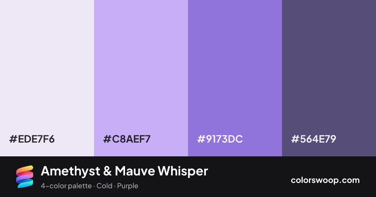
| Mauve | #C8AEF7 | rgb(200, 174, 247) | hsl(261, 82%, 83%) | oklch(79.9% 0.105 300) | |
| Amethyst | #9173DC | rgb(145, 115, 220) | hsl(257, 60%, 66%) | oklch(63.1% 0.155 295) | |
| Dusk | #564E79 | rgb(86, 78, 121) | hsl(251, 22%, 39%) | oklch(45.0% 0.070 292) |
Amethyst & Mauve Whisper is a monochromatic color palette tagged cold, purple. A monochromatic set: the same hue family from Dusk down to Lavender. Saturation is moderate, which keeps it flexible for both interfaces and print. The overall temperature is cool.
With 4 chromatic colors, Mauve takes the lead while the rest support. Lightness runs from 39% to 94%. Well suited to websites, presentations and branding.
1 of 6 color pairs pass WCAG AA (4.5:1); the strongest is Lavender on Dusk at 6.29:1.
A palette preview that turns four colors into a page, so you can judge hierarchy, contrast and mood before you commit.
Primary action SecondaryColor-blind check: all four colors stay distinguishable under protanopia, deuteranopia and tritanopia.
| Pair | Sample | Ratio | Level |
|---|---|---|---|
#EDE7F6 on #564E79 | Aa | 6.29:1 | AA |
#C8AEF7 on #564E79 | Aa | 3.93:1 | AA large only |
#EDE7F6 on #9173DC | Aa | 3.05:1 | AA large only |
#9173DC on #564E79 | Aa | 2.06:1 | Fail |
#C8AEF7 on #9173DC | Aa | 1.91:1 | Fail |
#EDE7F6 on #C8AEF7 | Aa | 1.6:1 | Fail |